
What Colors Are Best For Professional Headshots
Introduction
First impressions matter. And when it comes to professional headshots, the color you wear can be just as important as your smile. The right shades can highlight your personality, make you look approachable, and even strengthen your professional brand. On the flip side, the wrong colors can look distracting, wash you out, or send the wrong message altogether.
Let’s dive into the science, psychology, and practical styling tips behind choosing the best colors for professional headshots.
The Role of Color in Professional Photography
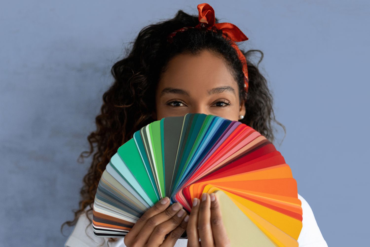
Colors are powerful. They instantly communicate mood, personality, and confidence. In photography, they also play with lighting, contrast, and skin tones. A well-chosen color can make you appear more polished and professional, while poor choices can make a headshot look amateurish.
Think of color as a silent storyteller—it subtly conveys who you are before you even say a word.
Neutral Colors: The Safe Bet
Black: Timeless and Classic
Black exudes confidence, sophistication, and authority. It’s a universal choice that works well in most industries. But be cautious—it can sometimes look too harsh, especially on lighter skin tones or when shot against a dark background.
White: Clean and Approachable
White projects freshness, honesty, and simplicity. It’s a great choice for industries that value approachability. However, it can sometimes look flat if paired with a white background, so consider layering with a jacket or accessories.
Gray: Balanced and Versatile
Gray is a go-to for balance—it’s not too bold, not too dull. Whether it’s light gray or charcoal, this shade works wonderfully across different settings and skin tones.
Earth Tones for Warmth and Reliability
If you want to give off an authentic, grounded vibe, earth tones are your best friend.
- Brown and beige make you appear trustworthy and approachable.
- Olive or muted greens convey subtle confidence and natural energy without being overwhelming.
These tones are especially effective in outdoor or lifestyle headshots.
Blues: The Universal Professional Choice
Blue is arguably the most professional color family for headshots.
- Navy blue conveys trust, stability, and authority—perfect for corporate roles.
- Light blue communicates friendliness, calmness, and approachability.
No wonder so many CEOs and executives wear navy suits in their portraits.
Bold Colors Done Right
Bold colors can work if handled carefully.
- Red is the color of passion, energy, and power. But too much can be overwhelming. Choose deeper shades like burgundy or maroon for sophistication.
- Royal blue and emerald green strike a perfect balance—bold enough to stand out, but still professional.
Colors to Avoid in Headshots
Not all colors are headshot-friendly. Avoid:
- Neon shades that glow unnaturally under studio lights.
- Bright yellows and oranges, which often clash with skin tones.
- Shiny fabrics that reflect light and distract from your face.
Your headshot should highlight you, not your clothes.
Skin Tone and Color Harmony
Knowing your undertone is key.
- Warm undertones (golden/peachy skin) look great in earthy shades, warm reds, and olive greens.
- Cool undertones (pink/blue skin) shine in jewel tones like sapphire, emerald, or cool grays.
- Neutral undertones can pull off both warm and cool palettes—lucky you!
Background Colors and Contrast
The background plays a huge role.
- White backgrounds pop best with darker attire.
- Dark backgrounds balance nicely with lighter shades.
- Outdoor/natural light settings allow more flexibility with earth tones and blues.
Always make sure you contrast your clothing against the backdrop.
Gender and Industry Considerations
- Corporate settings often prefer neutral or dark tones like navy, gray, or black.
- Creative industries allow more flexibility—subtle patterns, brighter colors, or trendy combinations.
- For men: solid shirts with blazers work best.
- For women: jewel tones, blouses, and dresses with minimal patterns project polish and professionalism.
The Psychology of Color in Branding
Your clothing color isn’t just fashion—it’s branding.
- A lawyer in navy conveys authority.
- A startup founder in light blue shows approachability.
- A creative professional in emerald green radiates innovation.
Choose colors that align with your personal or company brand.
Accessories and Layering
Accessories can complement your headshot, but they shouldn’t steal the show.
- Ties and blazers add structure.
- Jewelry should be minimal and subtle.
- Avoid flashy or oversized pieces—they distract from your face.
Styling Tips for Maximum Impact
- Monochrome outfits create an elegant, streamlined look.
- Subtle patterns can work, but avoid loud prints.
- Consider seasonal adjustments—lighter shades in summer, deeper hues in winter.
Common Mistakes to Avoid
- Wearing the same color as your background.
- Over-accessorizing with jewelry or ties.
- Choosing trendy neon or shiny fabrics that don’t age well.
Final Checklist Before Your Headshot Session
- Stick to solid, professional colors.
- Avoid patterns that distract.
- Ensure your attire contrasts with your background.
- Keep accessories minimal.
- Pick shades that align with your undertone and professional image.
Conclusion
Your professional headshot is more than just a photo—it’s your visual business card. The colors you wear set the tone for how you’re perceived, from approachable and trustworthy to powerful and confident. Neutral tones, blues, and earth shades remain the best universal choices, while bold colors should be used sparingly and strategically.
At the end of the day, the best color is the one that reflects both your personality and professional goals. Dress with intention, and let your headshot tell your story before you say a word.
FAQs
1. What color looks best on camera for headshots?
Navy blue, gray, and earth tones typically look best as they flatter most skin tones and look professional on camera.
2. Should I avoid wearing black for a professional photo?
Not necessarily. Black is timeless and professional but should be contrasted with a lighter background or layered with accessories.
3. How do I pick colors if I’m unsure of my undertone?
Stick to safe universal choices like navy blue, gray, or jewel tones. These work well across undertones.
4. Are patterns ever acceptable in professional headshots?
Yes, but keep them subtle. Avoid loud prints or busy designs that distract from your face.
5. Does the background color affect what I should wear?
Absolutely. Always ensure your clothing contrasts with the background so your face remains the focal point.